That’s right! All code. I redesigned my personal site to include my resume, blogs, and projects.
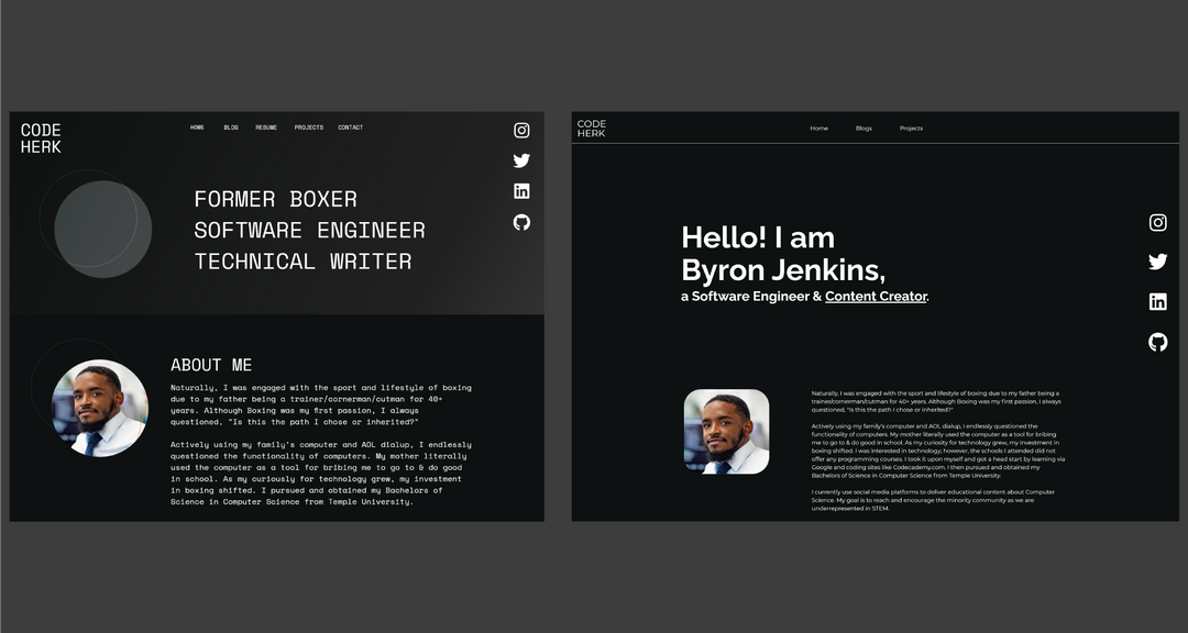
Designs made in Adobe XD.
From Left to Right: Desktop Design, Code Result
As I worked on the coding from the designs, the typography continued to feel like it didn't fit. I made some big changes that makes it different from design and I was completely okay with that.
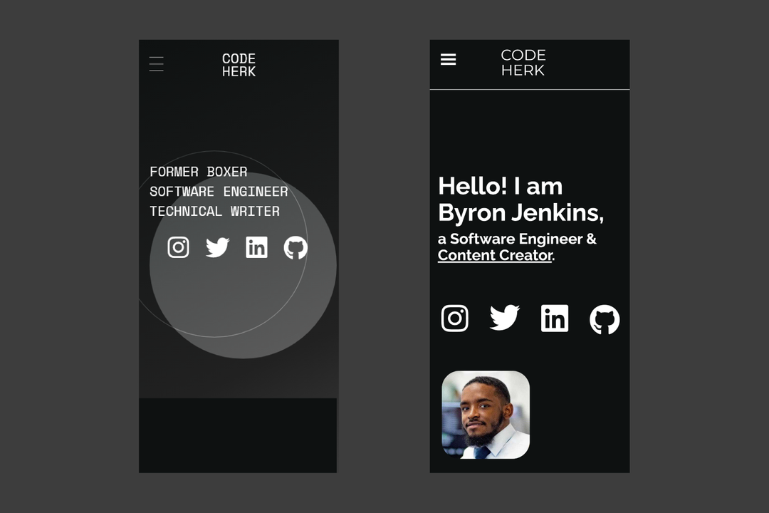
From Left to Right: Mobile Design, Code Result
It is crucial to make sure your site is responsive, meaning that it renders well on a variety of devices and window or screen sizes. I achieved that by:
- Using media queries in CSS. Here's how it looks:
@media (min-width: 800px) {
  .example-class {
    padding: 0 6rem;
  }
}
This means that when the viewport has a width of 800px or more, .example-class will have that assigned padding.
-
coding for mobile first (look into Mobile First Design). See the example scss below from my website (look up Sassy CSS and how it differs from CSS).
.article {
  margin: 0 auto;
  padding: 0 2rem;
  transition: all 1s;

  @media (min-width: 800px) {
      padding: 0 6rem;
  }

  @media (min-width: 1224px) {
      padding: 0 25vw;
  }
}
So
.articlehas the mobile styling done first, and it doesn't need the explicit media query because I have done the query with the other sizes. I have 3 designs for different viewport sizes:- min-width > 800px (mobile)
- min-width <= 800px & min-width > 1224px (tablet)
- min-width <= 1224px (desktop)
TECH & TOOLS
- HTML, CSS, JS (aka the fundamental tech needed for web development)
- React (JavaScript library for building user interfaces)
- GatsbyJS (modern web framework for blazing fast websites)
- Adobe XD (UI/UX prototyping tool)
- GitHub (code hosting platform for version control)
- GitHub Pages (static site hosting service from GitHub repository)
If you would like to see the code of this website, visit my repo on GitHub. The source code is under the dev branch.
Let me know what you think!

